Branding
Console View

The Branding section allows administrators to fully customize the appearance of the Home Realm Discovery (HRD) sign-in page.
This enables organizations to deliver a white-labeled authentication experience that aligns with their corporate identity while maintaining secure federated authentication.
Overview
The branding interface provides a real-time preview of how users will experience the sign-in page, making it easy to experiment with visual changes before applying them.
Branding Sections
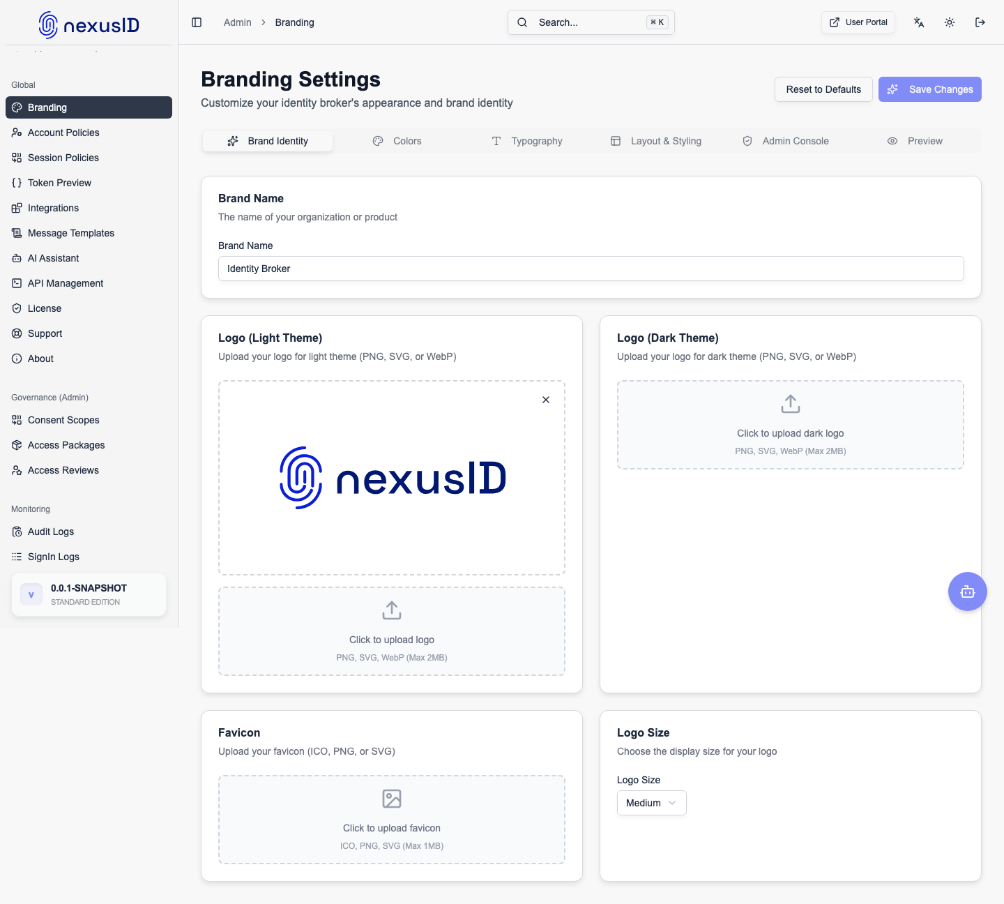
Branding settings are organized into four tabs:
- Basics
- Colors & Background
- Typography
- Layout & Styling
Each section controls a specific part of the sign-in page UI.
Logo Settings (Basics)
The Logo Settings section controls the branding displayed at the top of the sign-in page.
Available Options
- Upload Logo
- Supported formats: SVG, PNG (transparent background recommended)
- Maximum size: 2MB
- Logo Size
- Small
- Medium (default)
- Large
Logos are immediately reflected in the live preview panel.
Background Settings
Administrators can choose how the background of the sign-in page appears.
Background Types
- Solid Color
- Gradient
- Image
Gradient Configuration
When using a gradient background:
- Configure Start Color
- Configure End Color
- Preview updates in real time
This is useful for subtle brand theming without overpowering the sign-in form.
Live Preview
The Live Preview panel displays:
- Logo placement and size
- Background style (solid, gradient, image)
- Layout of the email input field
- Button placement and styling
This ensures changes are reviewed visually before being saved.
Typography
Typography settings allow you to control how text appears on the sign-in page:
- Font family selection
- Font size scaling
- Text color for headers and input labels
Consistent typography helps align authentication flows with the rest of your product UI.
Layout & Styling
Layout options give fine-grained control over the sign-in form presentation:
- Card width and alignment
- Padding and spacing
- Border radius
- Button styling
These controls help adapt the sign-in experience for desktop and mobile users.
Actions
At the bottom of the page, administrators can:
- Test Connection – Validate branding configuration without affecting users
- Save Configuration – Apply branding changes to the live sign-in page
Changes are applied immediately once saved.
Best Practices
- Use SVG logos for best clarity across screen sizes
- Keep background colors subtle to maintain readability
- Test branding changes across desktop and mobile devices
- Align branding with your primary application UI for a seamless experience
Use Cases
- White-label authentication for SaaS customers
- Enterprise-specific login branding
- Multi-tenant deployments with shared infrastructure
- Consistent user experience across identity flows
The Branding module ensures Identity Broker integrates seamlessly into your product ecosystem while maintaining a polished, professional authentication experience.